
Responsive website design services cover one job: building a single website that works well on a phone, a tablet, and a desktop, so every visit gets the same experience no matter the screen. That means a fluid grid layout, flexible images, a proper viewport setup, media queries that rearrange content at defined breakpoints, touch targets big enough for thumbs, and testing on real devices before launch. The honest 2026 price in the US is $1,000 to $5,000 for a basic responsive build, $2,000 to $10,000 for a solid small business site, and $10,000 to $50,000 or more for custom or ecommerce work. Our own website design services start at $799, run $1,999 for a full custom build, and $3,999 and up for larger work, with care plans at $99 to $399 a month. Fixed quotes, half to start, delivery in 2 to 8 weeks for standard builds.
This is not a cosmetic question anymore. Google finished its switch to 100% mobile-first indexing on 5 July 2024, so every site is now crawled exclusively by Googlebot Smartphone and a site that does not work on mobile will not be indexed at all (whitehat-seo.co.uk, mobile responsive web design). With 62.54% of global web traffic now coming from mobile devices (same source) and 53% of mobile visitors abandoning pages that take longer than 3 seconds to load (same source), a responsive build is the product, not a feature. This guide lays out what the service should include, what it costs, how long it takes, how to tell a good provider from a thin one, and why some sites win on phones while others leak half their traffic.
What should responsive website design services actually include?
The first thing to understand is that "responsive" is not a checkbox on a proposal. It is a bundle of engineering decisions, and a quote should spell out each one. A fluid grid lets columns reflow proportionally instead of breaking at phone widths. Flexible images scale within their containers rather than overflowing the screen. The viewport meta tag tells the browser how to scale the page on mobile, which sounds small and decides half of what a visitor sees. Media queries then apply different layouts at defined breakpoints, so a three-column services row becomes one stacked column on a phone and two columns on a tablet.
That is the technical core, but the parts users actually feel are smaller details. Touch targets need to be at least thumb-sized and spaced so a tap lands where the visitor aimed; nothing kills trust like a "call now" button that needs three tries. Mobile navigation has to be rethought, not shrunk: a seven-item desktop menu becomes a clear hamburger with the two most important actions pinned. Tap-to-call belongs on every screen a lead might land on, and checkout on mobile has to survive with fewer fields, clear progress, and no desktop-only hover states. Any agency offering responsive work should walk you through these decisions during discovery, not discover them at launch.
Then comes testing, and this is where cheap quotes cut corners. Device testing on real phones, not just a browser window dragged narrow, catches what emulators miss: how the layout behaves on actual device sizes, whether the sticky header covers the menu on a small iPhone, whether forms are usable with one thumb. A serious responsive implementation also uses a design system so spacing, type, and components stay consistent across breakpoints, and it watches page speed throughout, because a layout that shifts while it loads fails visitors and Core Web Vitals at the same time. Container queries are the newer technique worth asking about: they let a component respond to its own container instead of the whole screen, which matters for card grids reused in different page layouts.
Platform choice sits underneath all of this, and it changes what "responsive" costs to maintain. Most of the small business builds we ship are WordPress with Elementor, because that stack lets the client edit content and publish new pages without calling us, while the theme layer carries the responsive behavior. A custom responsive build on a bespoke stack is the right call when the site needs unusual functionality, but it also means every layout change runs through a developer. Either way, the visual design should come from one design system: shared components, one type scale, one spacing rhythm, so the mobile layout and the desktop layout are two expressions of the same design instead of two designs that drift apart over time. When the quote arrives, the responsive deliverables should be itemized, not bundled: fluid grid and breakpoints, flexible images with responsive markup, mobile navigation and touch targets, form and checkout testing on phones, Core Web Vitals targets, and a written device testing report. That list is what separates a web design agency doing responsive work from a design company bolting the word onto a fixed-width theme.
What you should receive at the end is a site, a test report showing the devices and breakpoints it was checked against, and training or docs so your team can publish content without breaking the layout. If a quote lists "responsive design" as a single line item with no deliverables attached, it is a label, not a service. Our website development services spell out the responsive deliverables line by line, because that is the only way two quotes become comparable.
How much do responsive website design services cost in 2026?
The short answer to "how much does responsive web design cost" is that the market splits into clear bands, and most of the price difference is scope, not vendor markup. A US agency FAQ that quotes responsive work regularly puts basic builds at $1,000 to $5,000 and custom high-performance sites at $10,000 to $50,000 or more, with typical timelines of 4 to 12 weeks (helloroketto.com, responsive web design services). DesignRush, which tracks agency pricing across hundreds of shops, reports $2,000 to $50,000 per website: small business $2,000 to $10,000 with annual maintenance at $400 to $1,200, corporate $10,000 to $30,000, ecommerce $5,000 to $50,000, and a top-50 average hourly rate of $83.50 (designrush.com, responsive web design agencies). Those bands are the honest context for anything you are quoted.

The 2026 cost bands, honestly described
Every quote for responsive website design services lands in one of three bands. The small business band, roughly $2,000 to $10,000, covers a brochure or lead site: five to ten pages, a responsive theme or custom skin, basic SEO, a contact or quote form, tap-to-call, analytics. The corporate band, $10,000 to $30,000, is where the design is custom to the brand: unique layouts per section, copywriting, photography direction, integrations with a CRM or booking system, and a design system the client's team can extend. The ecommerce band, $5,000 to $50,000, is priced on the catalog and the money path: product count, checkout complexity, payment and shipping integrations, and mobile conversion work, because that is where cart abandonment lives or dies.
Freelancer quotes under $2,000 are usually theme-based responsive builds, which is a legitimate way to get online cheaply, and agency retainers quoted hourly cluster around that $83.50 average for top shops. What matters is knowing which band you are in. A $1,500 freelancer and a $1,500 agency deposit are different purchases at the same number, and the band tells you which one you are holding.
What moves a quote between bands
Five things move a number more than anything else. Page count: every page that has to rank is a writing project, and writing is the slow expensive part. Custom design versus a customized theme: a design system drawn from scratch costs more because it is drawn from scratch. Copywriting: if you supply the words, the build is cheaper and usually better, because you know what customers ask on the phone. Integrations: tap-to-call is free to add, but booking software or a CRM connection is real engineering. And the depth of the mobile work itself: a site that is responsive in name only is cheap, while one with tested breakpoints, tuned touch targets, mobile-first navigation, and Core Web Vitals work baked in carries a real cost. A quote that looks unusually low usually assumed you are supplying the copy, the images, and the patience for post-launch fixes.
Our prices, placed against the market
Our prices are published and fixed, because secret pricing wastes everyone's time. Starter is $799: a template-based custom design, up to 5 responsive pages, mobile-friendly layout, basic on-page SEO, contact form and map, two-week delivery. Professional is $1,999: fully custom design, up to 10 responsive pages, advanced SEO plus schema markup, speed optimization, analytics and Search Console setup, blog. Enterprise is $3,999 and up: custom architecture from scratch, 15+ pages, booking systems, integrations, ecommerce builds. Care plans run $99 to $399 a month for updates, backups, security monitoring and uptime checks. Fixed quotes, 50% deposit, 2 to 8 week delivery for standard builds.
Placed honestly against the market: our Starter sits below the small business band, our Professional sits inside its lower half, and Enterprise covers the corporate and ecommerce range for projects that do not need a six-figure agency. The full breakdown is on our pricing page, where you can see exactly which responsive deliverables each tier includes before you ever talk to us.
One more cost most guides skip: the year after launch. A responsive site needs someone watching it, because phones, browsers, and plugins keep changing underneath it. DesignRush puts typical small business maintenance at $400 to $1,200 a year, which covers updates, backups, and keeping the layout working on new device sizes (designrush.com, responsive web design agencies). Budget that line separately from the build. The cheapest build with nobody maintaining it is how a three-year-old site ends up with a footer that says 2021 and a contact form that breaks on the newest iPhone. Our care plans exist for exactly this reason, and they are published at the same fixed prices as everything else.
How long does it take to build a responsive website?
The honest answer to "how long does it take to build a responsive website" is 4 to 12 weeks for most agency projects, which matches what US agencies report as their typical band (helloroketto.com, responsive web design services). The responsive work is not a separate phase tacked on at the end; it runs through every phase. A realistic answer to how long responsive website design services take depends on where the time goes:

| Phase | Typical duration | Where the responsive work happens |
|---|---|---|
| Discovery and sitemap | 1 week | Content priority for mobile screens, mobile navigation plan, breakpoint strategy |
| Design | 2 to 4 weeks | Mobile layouts designed first or alongside desktop, touch targets, type scale |
| Development | 2 to 4 weeks | Fluid grids, flexible images, media queries, container queries, lazy loading |
| Content and testing | 1 to 2 weeks | Real-device testing across device sizes, Core Web Vitals checks, form testing |
| Launch and QA | 1 week | Final mobile crawl check, redirects, analytics on the live URL |
Our standard builds run 2 to 8 weeks because we work from established systems rather than reinventing the responsive stack every time. What stretches a timeline is almost never the design work: it is content arriving late, approval rounds multiplying, and scope growing mid-build. Ask any provider where the responsive testing sits in their schedule; if the answer is "at the end, we check it on our phones," that is where mobile bugs go to hide. Mobile-first work puts the phone in the room from week one.
Who builds it changes the calendar too. A solo freelancer can sometimes move faster on a small site because there is one pair of hands and no review queue, but the timeline lives and dies on their availability, and one sick week is a one-week delay. A design agency runs discovery, design, and development as overlapping workstreams, which is slower to start and faster to finish once it is moving. Either model can deliver a good mobile responsive site. What you are really buying in the timeline is process discipline: a schedule with testing built in, a content deadline you both signed, and a launch date that survives contact with reality. If a provider cannot show you a week-by-week plan, the 4-to-12-week band is a hope, not a commitment.
Responsive vs adaptive design: which one should you buy?
This is the one comparison worth a table, because the two terms get used interchangeably and they are not the same product. Responsive design uses one fluid layout that rearranges itself at any screen width. Adaptive design serves separate fixed layouts for specific screen sizes, detecting the device and handing it a prebuilt version. Adaptive is sometimes sold alongside responsive website design services as the premium option; the truth is that it is the older approach with a maintenance cost that compounds every year.
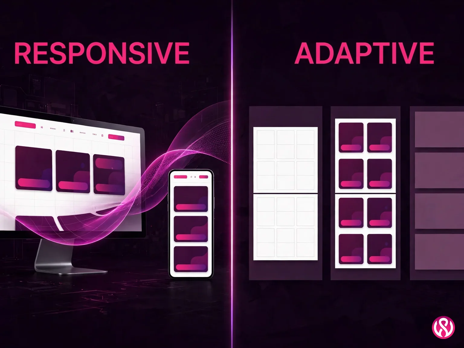
| Factor | Responsive design | Adaptive design |
|---|---|---|
| Layouts maintained | One codebase, one HTML | Multiple fixed layouts per device class |
| New devices | Handled by fluid grids automatically | Need new fixed layouts built |
| SEO and indexing | Single URL, Google's recommended setup | Redirect and canonical risk between versions |
| Maintenance cost | Change once, ships everywhere | Every change repeated per layout |
| Best for | Nearly every business website | Rare edge cases with heavy per-device customization |
Google explicitly recommends responsive design as the preferred mobile configuration: one URL, one set of HTML, simpler crawling and indexing (whitehat-seo.co.uk, citing developers.google.com). The old debate of responsive design vs separate mobile site is settled in practice too. A separate m-dot mobile site (m.yoursite.com) was the standard answer a decade ago; today it means maintaining two sites, splitting your link authority, and managing redirects that break every time marketing launches a campaign. You also do not need a mobile app for this: unless your business needs push notifications or offline-first tooling, a responsive website is the cheaper, better-indexed answer for reaching phone users.
There is one nuance worth keeping. Some very large sites still use adaptive techniques for performance, serving lighter markup to phones. But that is an optimization applied on top of a responsive foundation by teams with the budget to maintain two code paths, not a reason to buy separate fixed layouts for a small business site. For everyone else, responsive is the buy.
One more practical note on the comparison. If a provider pitches adaptive as the premium tier of their responsive vs adaptive design offering, ask what happens to the layout and navigation when a new device class appears. With responsive, the fluid grid absorbs it. With adaptive, someone opens a ticket, someone writes a fixed layout, someone bills for the hours, and your marketing team learns to dread phone launches. The maintenance math is the real comparison, not the launch-day screenshots. And in mobile-first design, the question to ask is not which breakpoints were drawn but whether the phone experience was designed first or squeezed out of the desktop one afterward. The answer shows up in every tap, every form, and every conversion rate the site ever reports.
How did mobile-first indexing change the stakes in 2024?
On 5 July 2024, Google completed its move to 100% mobile-first indexing. That sentence deserves a second read: every website is now crawled exclusively by Googlebot Smartphone, and a site that is not accessible on mobile will not be indexed at all. This is not a "mobile-friendly bonus." It is the baseline condition for existing in Google's index (whitehat-seo.co.uk, mobile responsive web design). If your desktop site is beautiful and your mobile experience is broken, Google now sees the broken version first and, increasingly, only.
So does responsive web design help SEO? Indirectly, and powerfully. Google does not hand out ranking points for the word "responsive." But a mobile-first website design that starts every decision from the phone screen earns the signals that do move rankings: lower bounce rates, longer engagement, fewer pogo-sticking visits back to the results page. The traffic numbers explain why this compounds. With 62.54% of global web traffic coming from mobile, the mobile version of your site is your main site by audience (same source). That mobile traffic is where your visitors already are, and a desktop-first site in a mobile-majority market is a store that remodels the back room and leaves the front door stuck.
Then there is speed, where the numbers are unforgiving. Google's research found 53% of mobile visitors abandon sites taking longer than 3 seconds to load, and the probability of a bounce increases 123% at 10 seconds (same source). The thresholds Google measures are the Core Web Vitals: Largest Contentful Paint under 2.5 seconds, Interaction to Next Paint under 200 milliseconds (INP replaced the older FID metric in March 2024), and Cumulative Layout Shift under 0.1. Only 47% of websites pass all three, according to a 2025 Magnet.co analysis (same source), which means passing them is a genuine competitive edge, not table stakes.
The business case is not theoretical. Vodafone measured an 8% increase in sales from a 31% improvement in LCP, and Swappie reported 42% higher mobile revenue after Core Web Vitals optimization (same source). That is the real shape of the SEO benefit: mobile-first indexing decides whether you are indexed at all, page speed decides whether visitors stay, and both are built into the responsive build, not bolted on after. Our page speed guide goes deeper on the optimization side for sites that already exist.
The sharpest edge of this is mobile commerce. A poor mobile experience does not just cost rankings; it costs the sale at the exact moment of intent. Shoppers compare on their phones, and a checkout that demands desktop-style precision, tiny form fields, and three pages of friction is where cart abandonment happens. Mobile usability is the difference between a product page that converts and one that researches for a competitor. The SEO benefits and the revenue benefits are the same work: fast, stable, thumb-friendly pages that keep the mobile majority on the site instead of sending them back to the results.
What questions should I ask a responsive web design company before hiring them?
Ask every company offering responsive website design services these ten questions before you sign anything. They are drawn from what actually goes wrong on responsive projects, and from the weakest pages on this very SERP, where freelancer listings rank with empty FAQs and no process at all. A good provider answers all ten without blinking; a weak one goes quiet around question four.
- Which breakpoints will you design for, and how do you handle screens between them? You want named breakpoints plus a plan for the in-between widths, usually fluid grids and CSS grid with flexbox doing the work. "We make it responsive" is not an answer.
- What does your real-device testing process look like? Ask for the device list and the test report format. Emulators and narrow browser windows are the start of testing, not the whole of it.
- How do you keep the layout from shifting while it loads? This is the CLS question. Reserved image space, font loading strategy, and no late-injected content above the fold. A blank stare here predicts a failing Core Web Vitals report later.
- What are your touch target sizes and mobile navigation approach? Minimum tap sizes, spacing, and a navigation pattern redesigned for thumbs rather than shrunk from desktop.
- How do you handle images for different screens? Responsive image markup with appropriate sizes per breakpoint, lazy loading below the fold, modern formats. A site that serves desktop-weight images to phones will fail every speed test.
- Who writes the copy, and how do headings work on mobile? Short headings that survive small screens, scannable structure, and a clear answer on whether copywriting is in the quote or on you.
- What happens to my SEO during the redesign? URL mapping, redirects, meta and schema preservation, Search Console monitoring. A responsive redesign should protect rankings, and that takes a plan, not luck.
- Do I own the site, the domain, and the content? In writing, in the contract. Monthly leases on sites you never own are still sold; you should own everything from launch day.
- Can I see client reviews and a recent launch on my own phone? Reviews tell you how the project felt to run; opening a recent client site on your own phone tells you how the work actually performs for a real user. Do both before you sign.
- What does support look like after launch? Updates, backups, security monitoring, and who fixes what when something breaks. Ours is published: care plans from $99 to $399 a month.
Red flags travel with the weak pages on this SERP: an FAQ section with zero questions or three generic ones, no described process anywhere on the page, a portfolio that shows desktop screenshots only, and a bio about a completely different specialty with "web design" added at the end. These are the listings from agencies offering responsive work in name only, and the pattern is visible before you ever request a quote.
Price without a deliverable list is the biggest red flag of all. If you cannot tell what the number buys, the number is not the bargain it looks like. A fixed quote that itemizes the responsive work, the testing, and the support is the only kind worth comparing, and it is the standard we hold ourselves to on our own pricing page.
Why do businesses hire Websloop for responsive design?
We built our whole pricing page around one frustration: every agency we competed with hid the number, so clients could not compare anything. This is why businesses hire Websloop: responsive website design services with fixed prices published in the open ($799, $1,999, $3,999 and up), mobile-first builds where the phone layout is designed alongside the desktop one instead of squeezed from it, SEO baked into the build rather than sold as a surprise second project, and full ownership from launch day. You own the site, the domain, and the content. No lease, no hostage situations.
The responsive work shows up in the numbers our clients care about. Agency case studies on this SERP back the pattern: after a responsive redesign, Big Drop's client saw a 15% increase in conversion, a 9% increase in page load speed, and a 17% increase in on-site engagement (designrush.com, responsive web design agencies). The mechanism is the same one behind the Vodafone and Swappie results: faster, stable, thumb-friendly pages convert the mobile majority instead of losing it. That is the difference between a site that is technically responsive and one that was built for phones on purpose.

We also keep the ongoing costs boring and predictable. Care plans from $99 to $399 a month cover updates, backups, security monitoring and uptime checks, so the site stays fast and responsive after launch instead of drifting. Every build ships with the SEO foundation our team uses on its own pages: clean URLs, meta and headings set properly, schema where it fits, analytics and Search Console wired up, and a handover that shows your people how to publish without breaking the mobile layout. That is the support a responsive site actually needs: not a ticket queue, but a site that stays healthy because someone planned for year two. You can see our work before you commit, and the free quote form takes about two minutes. We answer with a fixed price in writing, usually within one business day.
If you are ready for responsive website design services with fixed pricing, a mobile-first build process, and no surprises after launch, contact us and tell us about the project. We will tell you honestly which tier fits, including when the honest answer is that you do not need us yet.