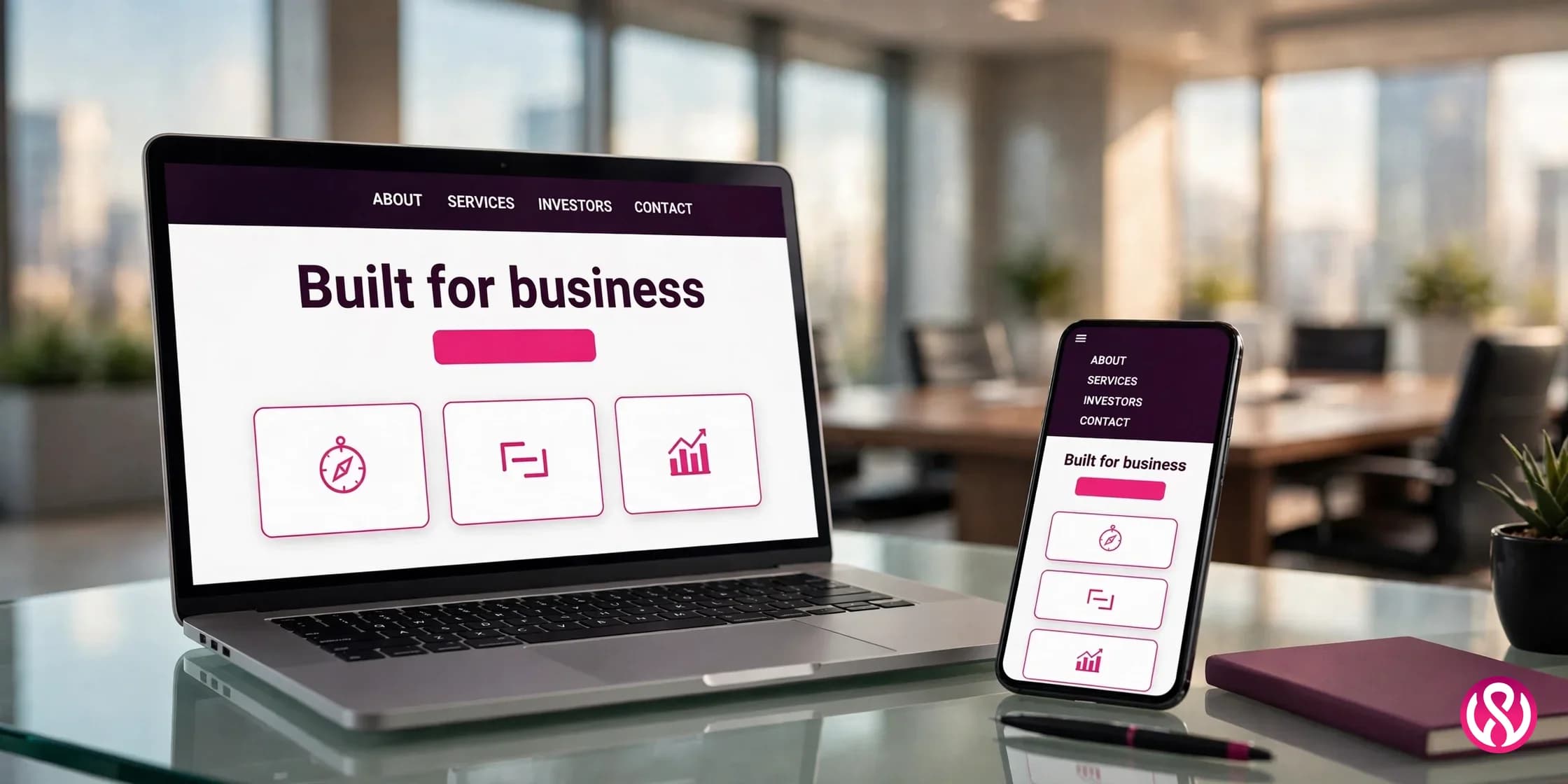
Corporate website design is the practice of building a company's public website around the needs of several audiences at once: customers, investors, job seekers, and the press. A good one earns trust in the first few seconds, answers the main question each visitor came with, and turns visits into sales conversations, investor confidence, and job applications. Everything else is decoration.
That definition sounds simple, but it is the standard most corporate sites fail to meet. The usual failure is not a bad homepage. It is a site planned around one audience (usually the marketing team) while everyone else gets leftovers. If you want to know what makes a good corporate website, the answer is not a prettier hero section. It is deliberate decisions about content strategy, information architecture, and who the site is really for, before a single pixel gets placed. Our website design services start every build the same way, and this guide walks through the decisions in the order a buyer actually needs them: what the site must do, what works, what it costs, how long it takes, how it differs from small business work, and how to pick an agency.
What a Corporate Website Must Do for Each Audience
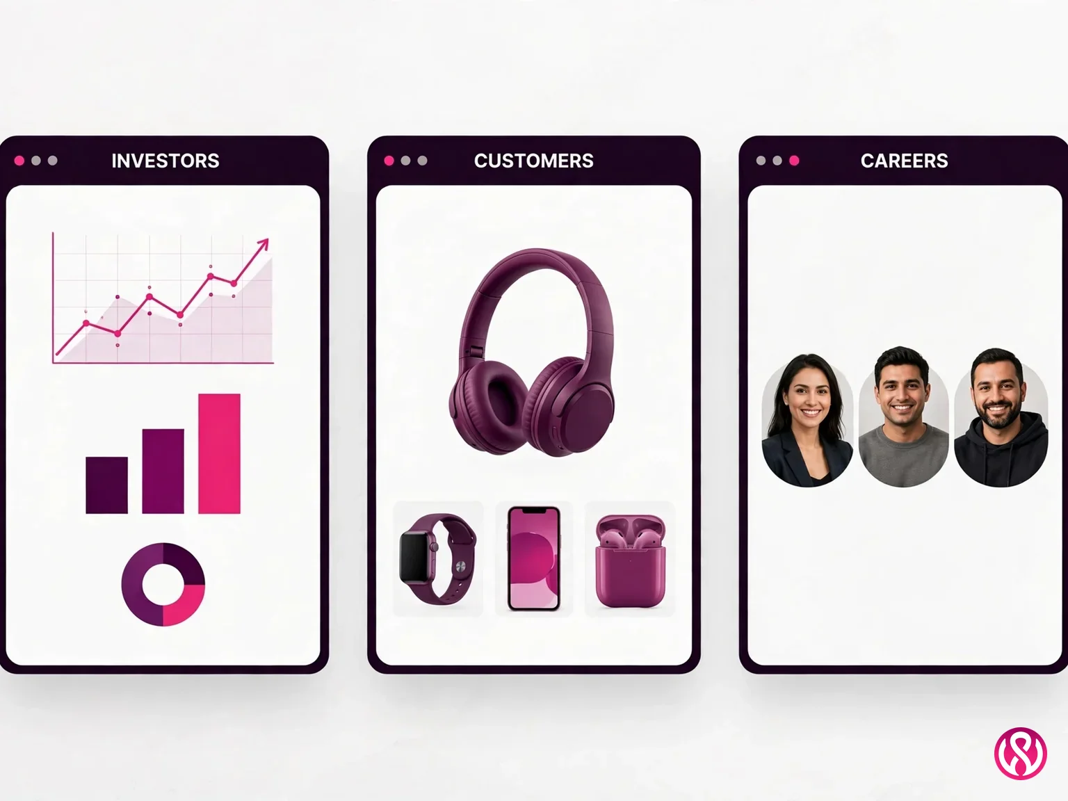
A corporate website is never read by one person with one goal. Corporate websites serve many users at once, and no two users arrive with the same goal. On any given day the same homepage serves a buyer comparing vendors, an analyst checking your financials, a candidate deciding whether to apply, and a journalist on deadline. Each of them judges the company by how easily the site serves them. That is why multi-audience navigation is the first design decision, not an afterthought. Good corporate website design gives every audience a clear front door, usually right in the main navigation, and keeps the content for each one separate enough that nobody has to wade through someone else's material. If the company operates in several countries, multilingual support belongs in the same planning conversation: one site with a CMS that supports multi-region publishing and translation workflows, instead of five disconnected regional websites that drift apart within a year.
Customers and prospects
Buyers arrive skeptical. They want to know what you do, who you have done it for, and what happens if they contact you. That means clear service and product pages, visible trust signals, real testimonials with names and companies attached, and case studies that show outcomes instead of adjectives. The conversion path should be obvious from every page: a contact form, a phone number, a demo request, not a scavenger hunt. Even when the site is not a store, ecommerce thinking helps here: a site that accepts online orders still needs our ecommerce website design standards for checkout clarity and trust, because the same buyer confidence is at stake.
Investors and partners
Investors do not browse. They scan for specific things: financial reports, leadership bios, governance documents, recent news, and a clear statement of where the company is going. An investor relations section earns its place in the main navigation the moment the company is publicly traded or raising money. Keep it current. A press page whose latest news is two years old tells an investor the company is asleep, and that damage is worse than having no press page at all.
Job seekers
The careers portal is one of the most visited sections on any corporate site, and one of the most neglected. Candidates want three things: open roles with real descriptions, an honest picture of the culture, and a way to apply that works on a phone. If your best people find you through the website, the careers section deserves the same design care as the homepage. Put it in the main navigation, not buried in a footer link labeled “Jobs” that leads to a bare list of titles.
Media and analysts
Journalists and analysts need logos, brand assets, executive bios, company facts, and contact details for someone who answers quickly. A simple, well-organized newsroom page saves them time and shapes how the company gets written about. Include a media contact who actually responds, downloadable high-resolution images, and a one-page company fact sheet. This is stakeholder engagement at its most direct: the site doing relationship work while everyone is asleep.
Corporate Website Design Best Practices That Actually Move the Needle
There are thousands of best-practices listicles for corporate website design, and most of them read like they were written to fill space. This section keeps only the practices we have seen move the needle on real corporate builds: the ones that affect trust, legal exposure, rankings, and revenue. Four of them, each explained in plain terms, plus a note on the interactive elements (calculators, configurators, self-serve tools) that keep business users on the page instead of sending them back to Google.
Brand consistency at scale
A corporate site is built and edited by many people over many years. Without a design system, it drifts: headings change sizes, button colors multiply, and every new page looks like it came from a different company. Brand consistency is not a logo rule. It is a documented system of type scales, spacing, colors, components, and image rules that anyone touching the site must follow. Build the design system during the project, not after, and make it part of the handover. Visual hierarchy follows from the same system: one scale for headings, one treatment for primary actions, consistent spacing rhythm everywhere. When the visual hierarchy is consistent, visitors learn how to read the site once and reuse that learning on every page.
Information architecture and navigation
Information architecture is the skeleton of the site: which pages exist, how they group together, and how a visitor moves between them. On corporate sites it fails in two familiar ways. The first is mirror navigation, where the menu copies the org chart instead of the visitor's goals (“Division of Consumer Solutions, Subgroup C”). The second is sprawl, where years of campaigns leave hundreds of orphan pages nobody maintains. Fix both with one discipline: every page must have a clear owner, a clear audience, and a path from the homepage in three clicks or fewer. Navigation labels should use the audience's words, not the company's internal vocabulary. Card-sorting and a content audit before design starts will catch more problems than any navigation redesign after launch.
Accessibility is a legal risk, not a feature
Corporate sites get sued over accessibility. A lot. Seyfarth Shaw's analysis of federal court filings (published March 2026) counted 3,117 federal website-accessibility lawsuits in 2025, up 27% from 2,452 in 2024. Website cases were 36% of all ADA Title III federal filings, with New York (1,021), Florida (961), and Illinois (585) leading. And most corporate sites would lose: WebAIM's Million 2025 study found 94.8% of the top 1 million home pages failed basic WCAG checks, averaging 51 errors per page, as summarized by WCAG Safe.
The fixes are mostly unglamorous: keyboard-navigable menus, form labels, alt text on images, color contrast that meets WCAG standards, and captions on video. Build accessibility into the design system from day one, because retrofitting it onto a finished site costs several times more. Treat an accessibility audit as part of QA, the same as cross-browser testing, and keep a public accessibility statement on the site. For a corporate site, this is not virtue. It is risk management.
Performance and Core Web Vitals
A slow corporate site is a credibility problem with a price tag. Research from Google and Deloitte found that improving website speed by 0.1 seconds can increase conversion rates by up to 8%, as summarized in Blankboard's 2025 redesign ROI guide. On a corporate site doing serious traffic, that fraction of a second is worth real money, which is why we practice mobile-first design from the start: most of your visitors are on phones, and the phone experience is the experience.
Google measures the experience with Core Web Vitals: LCP (largest contentful paint, how fast the main content appears), INP (interaction to next paint, how quickly the page responds to input), and CLS (cumulative layout shift, how much the page jumps around while loading). Aim for all three in the “good” band on real mobile hardware, not just on a fast office connection. The usual corporate killers are oversized hero videos, chat widgets that load before content, and carousels of uncompressed images. A performance budget, agreed in writing before design starts, stops these from creeping back in after launch. Track the budget with the same analytics tools the marketing team already uses, and review it in every sprint so regressions get caught while they are cheap to fix.
How Much Does Corporate Website Design Cost in 2026?
The honest answer to how much does a corporate website cost is that it depends on whether you are refreshing, redesigning, or building something the business has never had. The cost breakdown below uses 2025 and 2026 industry benchmarks, not guesses, and then shows our own published prices for comparison. A similar cost breakdown method works for trades sites too, though the numbers differ by audience.
| Project type | Typical cost | What you get |
|---|---|---|
| Website refresh (10 to 30 pages) | $3,000 to $7,500 | Visual update on the same structure: new design layer, image upgrades, no replatforming |
| Refresh, medium site | $7,500 to $15,000 | Deeper visual and content refresh, templates rebuilt, partial restructuring |
| Refresh, large content site | $15,000 to $25,000+ | Full visual system rebuild on existing platform and content, new design system |
| Full redesign, basic business site | $15,000 to $30,000 | New strategy, design, and build from scratch on a standard page count |
| Full redesign, mid-market | $30,000 to $60,000 | Deeper content work, integrations, multi-audience structure, custom functionality |
| Full redesign, enterprise or SaaS platform | $60,000 to $150,000+ | Complex builds: multiple regions, deep integrations, custom applications, governance |
Those bands come from Blankboard Studio's 2025 guide to redesign costs and ROI, which also reports that performance and SEO-aligned redesigns deliver 30 to 80% conversion-rate increases and 2 to 3x organic traffic growth, per HubSpot's Website Redesign ROI Guide. The money question is not really the build cost. It is the payback, and we will get to that below.
Refresh bands
A refresh keeps the site's structure and platform and replaces the surface: new visual design, rebuilt templates, better images, tightened copy. Small sites of 10 to 30 pages land at $3,000 to $7,500, medium sites at $7,500 to $15,000, and larger content-driven sites at $15,000 to $25,000 or more. Refreshes make sense when the site's architecture is sound but it looks and feels dated. If the architecture is the problem, a refresh is paint on a cracked wall.
Full redesign bands
A full redesign starts over: strategy, information architecture, design, content, and build. Basic business sites run $15,000 to $30,000, mid-market content sites $30,000 to $60,000, and enterprise or SaaS platforms $60,000 to $150,000 or more. Ecommerce builds typically land between $50,000 and $200,000+ because checkout, catalog, and fulfillment logic are genuinely hard. A separate B2B benchmark from DesignLoud's ROI analysis puts enterprise redesigns at $25,000 to $75,000, with 10 to 25% inquiry increases, 20 to 35% better lead quality, and a payback period of 12 to 24 months. One warning from the same source: expect 30 to 90 days after launch before improvement shows up, because traffic usually dips while Google re-indexes the new structure.
What moves you between bands
Five decisions move a quote more than everything else combined. Page count is first: a 40-page site and a 400-page site are different projects. Second is who writes the copy: corporate content written by committee needs interviews, drafts, and revision rounds, which are real hours. Third is integrations: CRM, marketing automation, investor-relations data feeds, applicant tracking systems for the careers portal. Fourth is governance: approval workflows, role-based editing, staging environments, which multiply the build and the CMS configuration. Fifth is multilingual scope: every language is a partial second site. Nail these five before asking for a quote, and the numbers that come back will describe the same project.
Our own published pricing
We publish ours because secret pricing wastes everyone's time. Our Starter site is $799, Professional is $1,999, and Enterprise starts at $3,999 and up. Fixed quotes, 50% deposit to start, 2 to 8 week delivery for standard builds. Care plans run $99 to $399 a month for updates, backups, and security monitoring. The full breakdown lives on our pricing page with fixed prices on everything. And if the project needs custom code on top of the design, our website development services cover that side. We are upfront about this: corporate builds at our prices stay on the lighter end of the industry bands above, which is a feature for companies that want a serious site without an agency-of-record retainer.
How Long Does a Corporate Website Take to Build?
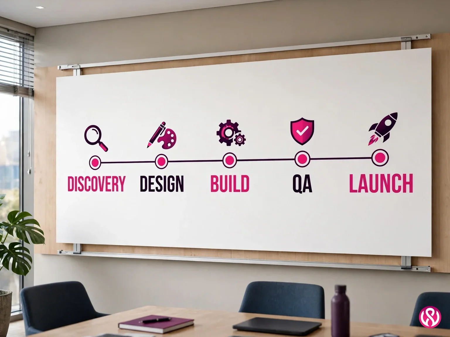
The direct answer to how long does a corporate website take to build is: 8 to 16 weeks or more for a typical redesign, depending on scope and how fast the company's own team can make decisions. The single biggest schedule risk on corporate projects is not the agency. It is approval delays inside the client's organization, which is why stakeholder engagement starts in week one, not in week ten when the design is done and the VP sees it for the first time.
Discovery: 2 to 3 weeks
Stakeholder interviews, a content audit of the existing site, analytics review, competitor review, and audience mapping. This is where the multi-audience structure from the first section gets decided, and where copy ownership gets assigned. Skipping discovery is the classic corporate mistake: the build starts fast and stalls the moment real content has to come from six departments.
Design: 3 to 4 weeks
Information architecture, wireframes for the key templates, then visual design built on the design system. Corporate design reviews run longer than small business ones because more people have opinions, so budget two formal review rounds and lock the system before build starts. Design is also where the accessibility decisions get made, cheaply, instead of expensively later.
Build: 4 to 6 weeks
Front-end development, CMS integration, and the integrations identified in discovery. Most corporate sites we build run on WordPress with a well-chosen theme or custom build, because the editing team already knows it and the governance requirements are manageable. Larger operations may need a headless CMS or a custom setup, which is a strategy conversation, not a default. Analytics and conversion tracking get wired in during the build, not bolted on after launch.
QA: 1 to 2 weeks
Cross-browser and cross-device testing, accessibility checks against the WCAG checklist, performance testing against the agreed budget, content review by every stakeholder, and a full dry run of forms, search, and the careers application flow. Corporate QA is slower because more pages and more edge cases, but it is also where the expensive surprises get caught while they are still cheap to fix.
Launch: 1 week, plus 30 to 90 days of watching
Redirects mapped and tested, analytics verified live, search console and sitemaps updated, then the switch. As noted in the cost section, organic traffic typically dips while Google re-indexes the new structure, so the first 30 to 90 days are for watching rankings and the conversion rate recover and climb, not for panicking. That post-launch window should be in the contract.
Corporate Website Design vs Small Business Web Design
A common question is how is corporate web design different from small business web design, and the honest answer is that the difference is organizational, not aesthetic. A small business site is designed around one decision maker, one audience, and one conversion action. A corporate site is designed around a committee, four audiences, and governance rules that outlive everyone currently employed. The table below makes it concrete.
| Aspect | Corporate site | Small business site |
|---|---|---|
| Decision makers | A committee: marketing, legal, IT, executives, sometimes the board | One owner, occasionally a partner |
| Audiences | Customers, investors, candidates, press | Local customers, mostly ready to buy or call |
| Page count | Dozens to hundreds, with news, careers, and IR sections | 5 to 15 focused pages |
| Governance | Approval workflows, role-based editing, staging environments | One person edits everything directly |
| Integrations | CRM, marketing automation, ATS for careers, IR data feeds | Contact form, maps, maybe booking |
| Compliance | WCAG accessibility, privacy regulations, financial disclosure rules | Basic privacy policy and contact details |
| Timeline | 8 to 16+ weeks | 2 to 6 weeks |
This is also where enterprise website design splits from ordinary corporate work. Enterprise adds scale on top of everything above: multiple regions and languages, hundreds of editors across business units, security reviews, procurement processes, and accessibility standards enforced by policy rather than preference. The budget follows the complexity, which is why enterprise bands start where corporate bands end. For smaller companies that still want a serious presence, our corporate builds sit in the middle: corporate structure and multi-audience thinking, without the enterprise price tag.
What to Ask a Corporate Web Design Agency Before You Hire Them
Choosing an agency is the most important decision in the project, because a good agency prevents the mistakes below from ever happening. The point of the nine questions is to ensure the agency you hire can create the site your audiences need, not just a prettier version of what you have. When people ask what questions should I ask a corporate web design agency, these are the nine we would want asked of us. Any agency worth hiring answers all of them without flinching.
- Who owns the site, the domain, and the content after launch? Get it in writing. You should own everything from day one.
- Is the quote fixed, and what exactly is in it? Page count, copywriting responsibility, integrations, revision rounds. “SEO included” means nothing without a deliverables list.
- How do you handle our approval process? Ask how they have worked with committees before. Vague answers here predict schedule slips.
- How will you make the site accessible? Listen for WCAG, keyboard navigation, and testing, not just “we follow best practices.”
- What is your migration and SEO plan? Redirect mapping, URL strategy, and how they will protect rankings through launch. This is where redesigns quietly lose half their traffic.
- What CMS do you recommend, and why? The answer should follow from your editing team's skills, not from what the agency likes to sell.
- Who writes the copy? If it is you, get the interview schedule and draft deadlines. If it is them, read samples of their corporate writing first.
- What happens after launch? Care plans, response times, and who fixes things when they break. A site with no maintenance plan is a site with an expiry date.
- Can we talk to two recent clients? References from similar-sized companies are worth more than any portfolio page.
And the red flags we tell people to watch for even when they hire someone else: hourly billing with no cap, a monthly lease on a site you will never own, no ownership clause in the contract, a portfolio with no corporate or multi-audience work, and a quote that cannot explain what moves the price. Walk away from any of these, or at least get the answers in writing before signing.
Corporate Website Design Examples Worth Studying
Nobody on this SERP publishes real buyer guidance, but several competitors publish example lists, so here is ours: five corporate website design examples worth studying, each with one takeaway stated in our own words. (You can also see our case studies for smaller-scale work we have done ourselves.)
Apple
Apple's corporate site is a study in restraint: enormous product imagery, almost no words, and a navigation that never makes you think. The takeaway is not “be Apple.” It is that confidence converts. When the product and the photography carry the weight, the design gets out of the way instead of performing.
Microsoft
Microsoft serves every audience a giant company has: consumers, enterprises, developers, investors, and job seekers, each reachable from the main navigation in one click. The takeaway is the audience routing done right: the homepage never tries to serve everyone in the hero. It sends each audience to a section built for them.
Salesforce
Salesforce's site is the clearest example of conversion architecture at corporate scale. Every page knows its one job, every section ends in a specific next step, and the free trial and demo paths are never more than a glance away. The takeaway: on a corporate site, the conversion rate is designed, not hoped for. Somebody drew every funnel on purpose.
Stripe
Stripe speaks to developers and executives in the same pages without patronizing either. The takeaway is tone discipline: one voice, precise and plain, sustained across thousands of pages. Most corporate sites fail this by letting each department write in its own dialect.
IBM
IBM's site demonstrates information architecture under extreme load: a century-old company with dozens of business lines still keeps navigation shallow and search genuinely useful. The takeaway is governance made visible. You can feel the content system working underneath, which is exactly what enterprise visitors need to sense.
How AI Is Changing Corporate Websites in 2026
Two shifts matter for corporate sites right now. The first is how people find you: Google's AI Overviews and AI Mode now answer many research questions directly on the results page, which means your corporate content has to be quotable, not just rankable. Clear definitions, direct answers in the first paragraph, and real numbers with named sources are what answer engines lift. The second shift is on the site itself: AI chatbots now handle the routine questions (pricing ranges, office locations, support hours) that used to eat your team's day, and they do it at 2 a.m. for a visitor in another time zone.
The honest trade-off: AI-generated content published without review is how corporate sites end up with confident, wrong answers on their own domain. Use AI to draft and to summarize, but keep a human expert signing off on anything the public reads, especially anything with numbers, legal implications, or your name on it. The companies winning with AI on their corporate sites use it for speed and coverage while keeping accountability human. That is also, not coincidentally, what Google's quality guidance has been saying for years.
Get a Corporate Website That Earns Its Keep
Good corporate website design is not decoration and not a brochure. It is a business asset that serves four audiences, carries the brand without drifting, survives an accessibility lawsuit review, loads fast on a phone, and turns visits into conversations. The companies that treat their site that way get the 30 to 80% conversion lifts and the 2 to 3x organic growth the research keeps reporting. The ones that treat it as a marketing expense get a pretty site and a quiet phone.
If you want the first kind, contact us for a fixed quote. We will ask about your audiences, your content, and your integrations before we name a number, and the number we name is the number you pay. Or start smaller with a free quote and see how the process feels.